Caffeinated

Caffeinated

Keeps your Mac awake.

3 followers

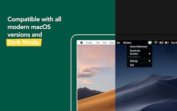
Caffeinated prevents your Mac from going to sleep, dimming your screen or starting the screensaver. Your screen goes dark when you don't want it to? Then Caffeinated is the perfect tool for you. Caffeinated was developed based on the helpful tool Caffeine. Caffeinated brings back the classic features to your Mac, but better. One click on the coffee cup in your menu bar is enough to keep your Mac awake. If needed, you can find additional options in a beautifully designed and easy-to-use app interface.
Caffeinated gallery image
Launch Team
Checkmarx Developer Assist for AI IDEs
Security linter for vibe coding: fix vulns as you build
Promoted

What do you think? …

Stephen Amos
Hi Lea, love the app thanks! Can I just confirm that messaging apps like Microsoft Teams would show me as active still even if I allow the display to sleep in settings?
Lea Hirschmüller
@stephen_amos1 Hi Stephen! Yes, you will still be shown as active in apps like Microsoft Teams, Skype and so on. The settings in Caffeinated don't affect those apps. They are tracking the mouse movement to determine wether you're active or not. 🙂
Lea Hirschmüller
Hello PH! Lea from the Caffeinated team here. Caffeinated is a Mac Menu Bar App that prevents your Mac from going to sleep, dimming your screen or starting the screensaver. It is available worldwide. Caffeinated is not only very convenient but also easy to use. Just right-click on the icon in your menu bar to prevent your screen from going to sleep. With a left-click on the icon you get all the important options and settings. ☕️ We'd love to get some feedback and I am more than happy to answer any questions! ✌️
Bevan Kay
@team_yugen What makes your app different to Amphetamine which is available on the app store for free?
Chris Messina
@team_yugen surprised by the name choice given that Caffeine has existed since before 2014 (personally, I use Lungo).
Liam
Agree, I am using Caffeine as well... what's the difference?
Lea Hirschmüller
@bevankay Hi Bevan! Thank you for your question. The two apps differ in their user interface and experience. Caffeinated has a more simplistic approach, similar to Caffeine. It still offers important features and options. This said, Amphetamine is a great app with a big variety of settings. It is up to you what you prefer. 🙂 - Lea
Lea Hirschmüller
@chrismessina Hi Chris! Indeed, Caffeinated is based on Caffeine, therefore the name choice. We started developing Caffeinated at a time when Caffeine wasn't compatible with our operating system. We wanted to create something similar, yet we included more features and options that we thought would make a nice addition to an anti-sleep app. ☕️ - Lea
Art Ginzburg
Great, now we have a pretty design in Lungo and awesome functionality in Caffeinated. Why is it always necessary to lose something of this?
Lea Hirschmüller
@dafuqtor Hey Art! Thank you for your feedback. In your opinion, what could we improve design-wise? We'd be happy to hear your thoughts! ☕️
Art Ginzburg
@lea_hirschmueller I actually like Settings submenu in Caffeinated, it's pretty and powerful, but Lungo's status menu is way better just because it allows to choose duration immediately and shows the remaining time very nicely next to the "Deactivate" button
Lea Hirschmüller
@dafuqtor Thanks so much for sharing your thoughts! Our intention is to keep the main menu as clean as possible. Therefore, we keep the duration options in a separate submenu as we offer quite a few of them. The remaining time is still shown directly in the status menu below the duration. But we understand if you prefer Lungo's menu structure. 🙂
Art Ginzburg
@lea_hirschmueller The fatal thing is that the user's attention always goes from left to right and finally concentrates on whatever that's on the right. This is the basis of the design, but if you need more facts, look at most of our languages: they are all designed to be read from left to right. And I really think you can feel it already. A coffee cup in Caffeinated logo is placed on the right side, and if you imagine it being on the left, you immediately realise that placing it on the right is the best idea. Anyway, what I wanted to say is: I was triggered by the words "main menu as clean as possible", and I'm a super-minimalistic design freak, because I actually notice how people around get more and more disturbed, step by step, by those sneaky little irritations and annoyances, such as Caffeinated menu having two "arrow" submenus almost in a row ("Duration" and "Settings"). In the end, Lungo wins in design because its developer focuses on design, and Caffeinated wins in functionality, for a similar reason. What would be cool is to have one app whose developer focused on both things. I know it's a small thing, but if we weren't all obsessed with small design-related things, we wouldn't be buying Apple products, right? :)
Lea Hirschmüller
@dafuqtor Thank you! Your feedback is much appreciated. I totally understand what you mean. Our App Store screenshots are not representative in this case and we will change those with our next update. In the app itself, the menu always opens to the right, as long as the screen size allows it. Our focus lies on functionality as well as design, so it is always good to get feedback. :)