
Autoplot
Unify data analysis and plotting in one powerful workspace
87 followers
Unify data analysis and plotting in one powerful workspace
87 followers
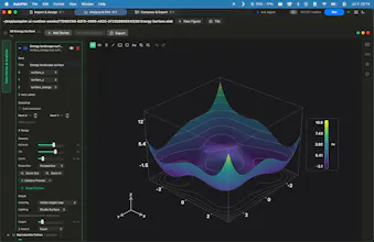
AutoPlot is a Mac native scientific workspace for plotting and exploratory data analysis. Import tabular datasets, create variables, build X&Y plots, histograms, heat maps, correlations, 3D plots, and charts, run fits, then compose figures with vector export. Metal-backed GPU rendering keeps 3D scenes and correlation networks interactive at full dataset size — rotate, zoom, and re-fit without waiting on a redraw. Raw data values never leave your Mac.


The reproducible-Python export is the right call, because with AI-written analysis the plot that renders cleanly is the one you stop checking. Every bad LLM-generated analysis we hit was silent, never a crash: NaN rows quietly dropped before a mean, or a default bin width smearing a real bimodal peak into one hump. The chart looks fine so nobody re-reads the code. Do you surface the assumptions the model made, rows dropped, null handling, aggregation choice, somewhere near the figure itself, so a wrong-but-pretty plot is catchable without opening the export every time?
@dipankar_sarkar You are right, this is the real problem. The bad LLM analysis never crash. It runs clean and looks nice — NaN rows dropped silently, a default bin width that flatten a bimodal peak, an aggregation that change the denominator without telling. The chart looks fine so nobody read the code again. But one important thing: most of our analyses are not AI-written at all. The core algorithms — the fits, the distributions, the binning, the scaling — are pre coded and tested. So for these you are not trusting LLM code, you are trusting vetted routines. The AI mostly prepares the data and drives these blocks, it does not reinvent the math each time. This already removes a big part of the silent-failure risk.
For the parts where the AI does write code, the reproducible Python is our answer. It is the real code of that exact figure, always in sync, so the assumptions are never lost — you can always recover them.
But you are right, recoverable is not the same as surfaced. A code panel that you must open every time will lose against a chart that looks good.
So the next step is exactly what you say: a small assumptions strip near the figure — rows dropped, null handling, bin/aggregation choice — so a wrong-but-pretty plot can be caught at one glance. To extract this from the generated code is not hard, because the code is structured. The real work is to show what is alarming, without becoming wallpaper that people stop reading.
So today: the core math is pre-coded and tested, the AI code is always reproducible and in sync, and making the assumptions loud at the figure is the right next step.
Unifying analysis and plotting in one place is a real pain point — too many tools force you to jump between a notebook and a separate charting tool. Does it support live data sources, or is it mainly for static datasets right now?
@ark_y_k Hello. Support for live data is in our roadmap. Thanks for your interest.
as someone who's bounced between a notebook for the analysis and a separate app for publication-quality figures, the vector export at the end of the pipeline is the part that stands out to me. what format does that export to - straight SVG/PDF, or does it keep layers editable in something like Illustrator? and does "raw data never leaves your Mac" mean fits run fully on-device too, or just the raw import step?
@galdayan Hello Gal, all the algorithms, pre-constructed or new ones, run on device. The AI doesn’t see your data, only headers, and returns python code that runs on device. So AI has been used to replace coding stage with python. It can also be used to manipulate data files inside the working folder to replace AWK type of command line tools. Vectorial output keeps layers editable in Pixelmator or similar apps.
@lts_sw that's a clean answer, thanks. replacing AWK-style munging with described intent is the part I hadn't considered - that's a bigger workflow win than the plotting itself for a lot of messy lab data. keeping the layers editable in Pixelmator after the fact is the detail that'll actually get this into people's publication pipeline. good luck with the launch.
the Metal-backed 3D plots are genuinely smooth, way better than fighting with matplotlib on a big dataset. kind of nice that everything stays local too
@mertcan815955 thanks. The smoothness in 3D plots was a must-have so we spent a lot time to improve this feature.
Would love a built-in scripting pane so I can automate repetitive fits and re-run an analysis when the underlying CSV gets updated. Right now I have to re-click through the same steps every time the dataset refreshes.
@hediye237189 thanks for the feedback. This is a feature we will be looking into.
The thing that finally worked for us was dumber than I expected: print rows in and rows plotted directly on the figure. We tried a warnings panel under the chart first and nobody read it, but 4,812 going to 4,109 in the corner got questioned every single time. Since AutoPlot is generating the Python anyway, could it always emit the row count at each filter step as part of the script, so the drop shows up in the output instead of in code nobody re-reads?
@dipankar_sarkar Dear Sarkar, can you send us an email that will allow us to reproduce the problem?